North Carolina ArcGIS Users Group |
Wild Apricot website themes
Website themes determine the overall look of Wild Apricot sites. A default website theme is assigned when you create your Wild Apricot account. You can choose a different website theme and customize your theme in a variety of ways. To learn more about website themes, you can visit our help page.
Website themes control the following elements of your website:
- Master layouts
- Default colors, shapes, and shades
- Default site background and background image library
- Text style choices in the content editor (e.g. Heading 1, Heading 2)
- ArtText choice in the content editor (e.g. Site title 1, Page heading 1)
- Customization options that appear on the Colors and Styles screen
- Menu location (vertical or horizontal) and whether the menu is static or dynamic (fly-out)
- Orientation of the log in form gadget (horizontal or vertical)
- Matching visual styles in online forms
You can, at any time, switch to a different theme. You can choose from a number of professionally designed themes in a variety of styles and colors.
Theme examples
Bookshelf and Whiteboard themes
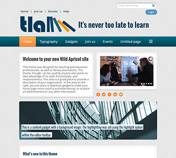
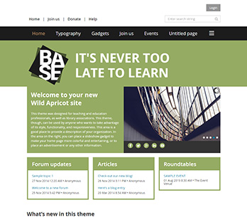
The Bookshelf and Whiteboard themes are fully responsive – aka mobile friendly. Sites that use Bookshelf and Whiteboard themes automatically scale their contents to fit properly on different sized screens, including mobile devices.
Whiteboard is the default theme assigned to your site when you create a new account. The Bookshelf theme has a simple but modern design featuring rounded edges and shadows. It was designed with library and teacher associations in mind, but can be used by any type of organization. The Whiteboard theme set is a simpler version of the Bookshelf theme set. There is more white space, and no shadows or gradients. The gadget styles are simpler, with fewer styles to choose from. It makes for a great starting point for a fully customized yet responsive site.
The colors and styles used by these themes can be fully customized from the Colors and Styles screen.
Fiesta and Blueprint themes
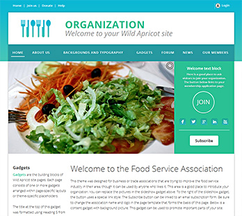
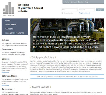
Both of these sets are series of themes designed for business and trade associations but can be used by any type of organization, particularly if you want to take advantage of their "sticky placeholder" feature. Using this feature, you can place a menu or logo within a non-scrolling area at the top of the page or within the sidebar, and it will remain in position as you scroll through the rest of the page. The Blueprint theme set also features a Promo text style with a transparent background and drop shadow that provides a clean yet dramatic effect when placed on top of background graphics.
Two approaches to theme design:
Customizable gadget styles vs more gadget style options
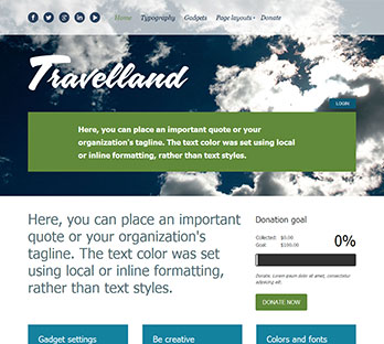
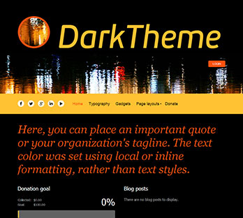 versus
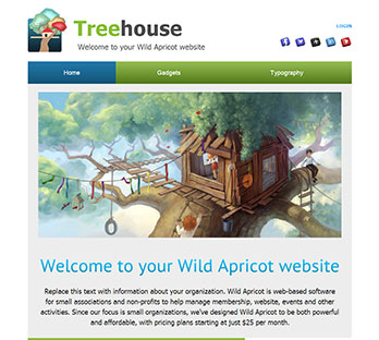
Clean Lines, White Space, and Dark Impact theme sets were designed to be very flexible by allowing you to change the color of every gadget. You can change the gadget background, font, titles, and link styles, and choose from gadget styles that you can customize yourself. The Treehouse theme set uses a different approach. While we do not give you the ability to change the colors of gadgets, we do provide more then 30 prepared styles to choose from. This way, you can be sure that your gadgets share the same look and feel. Which way is better? That is for our customers to decide. We see that both customization approaches are popular, so we will use both in our feature themes.